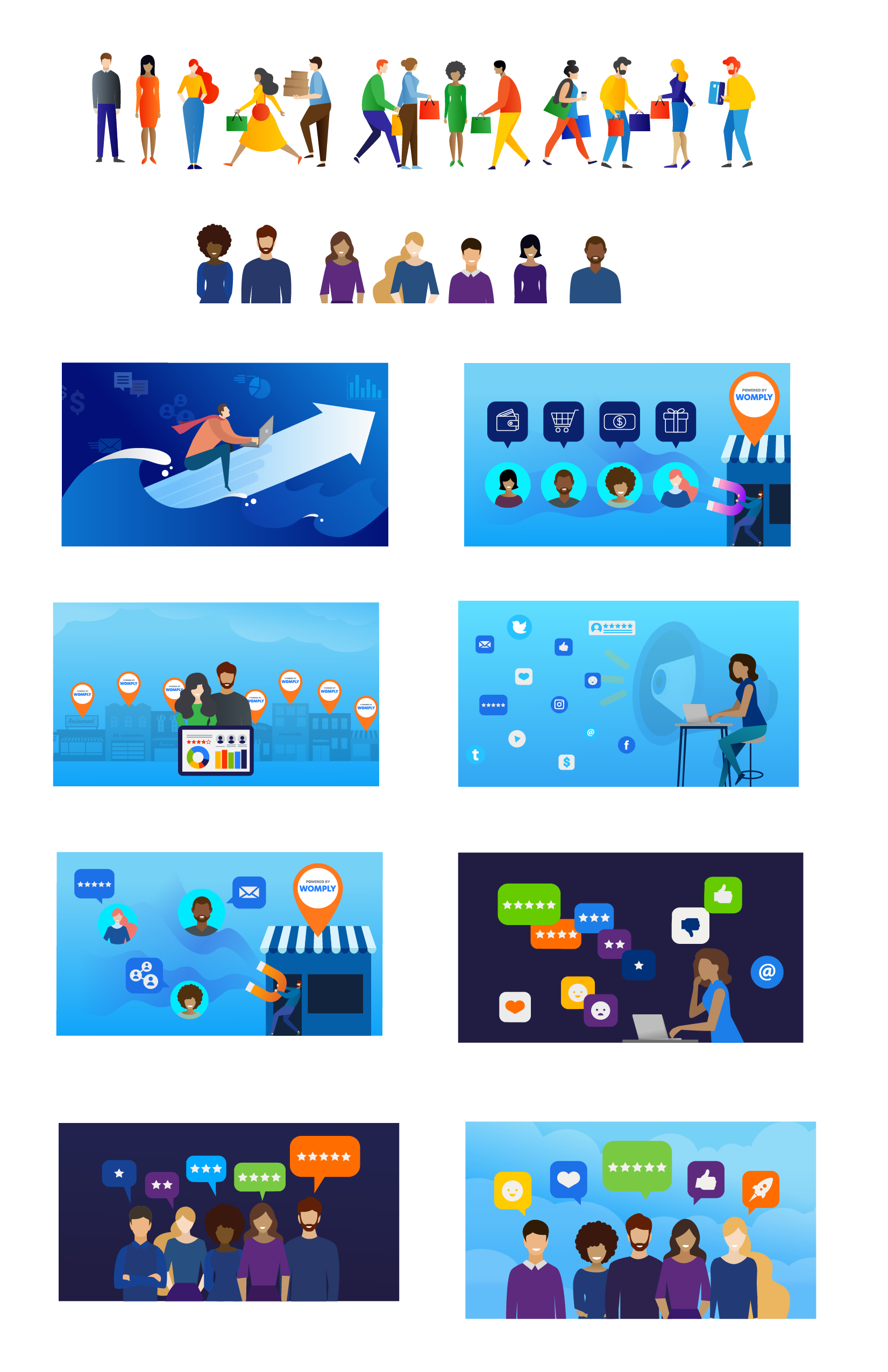
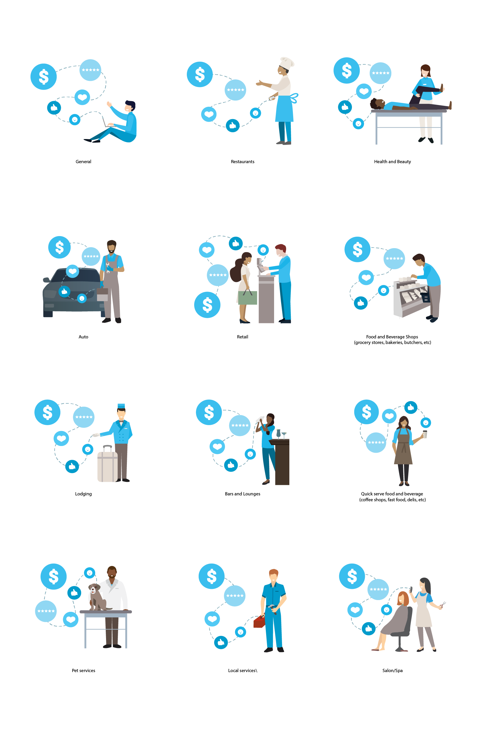
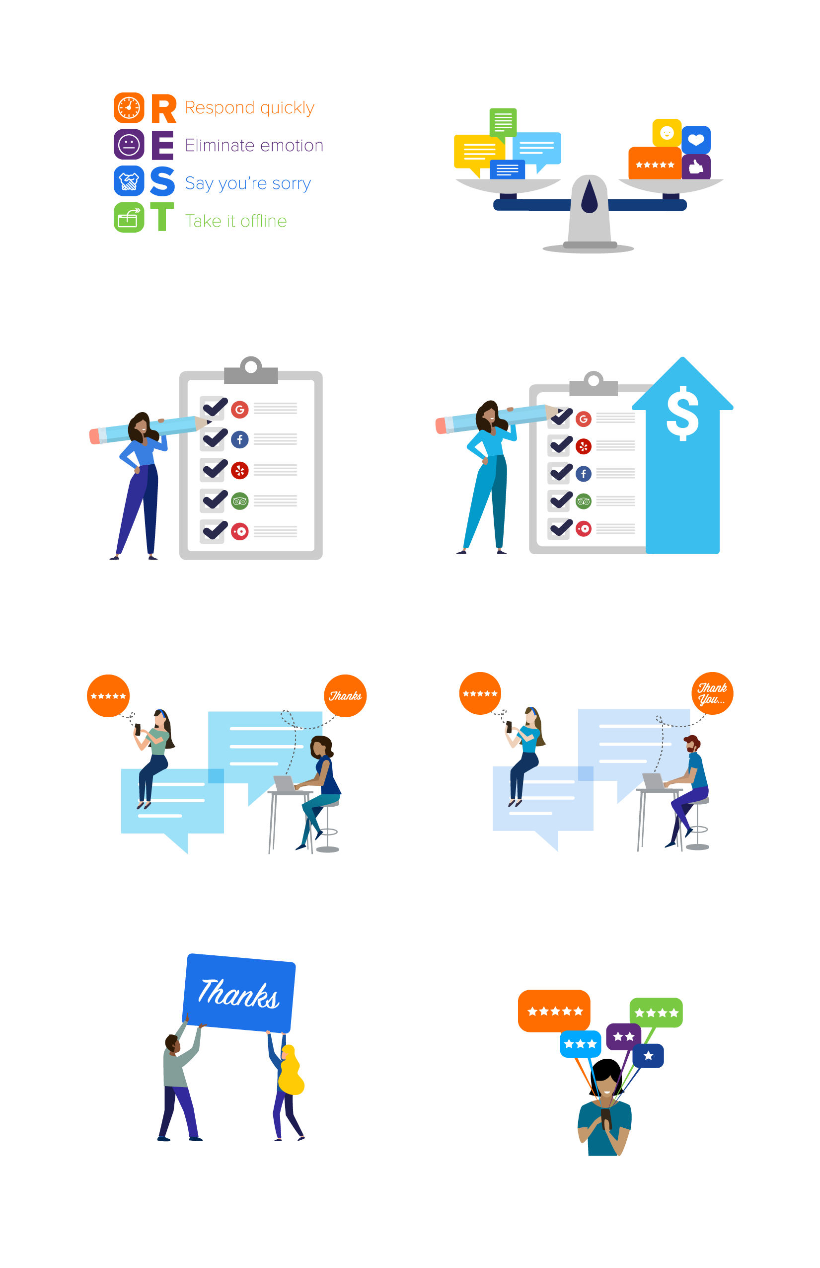
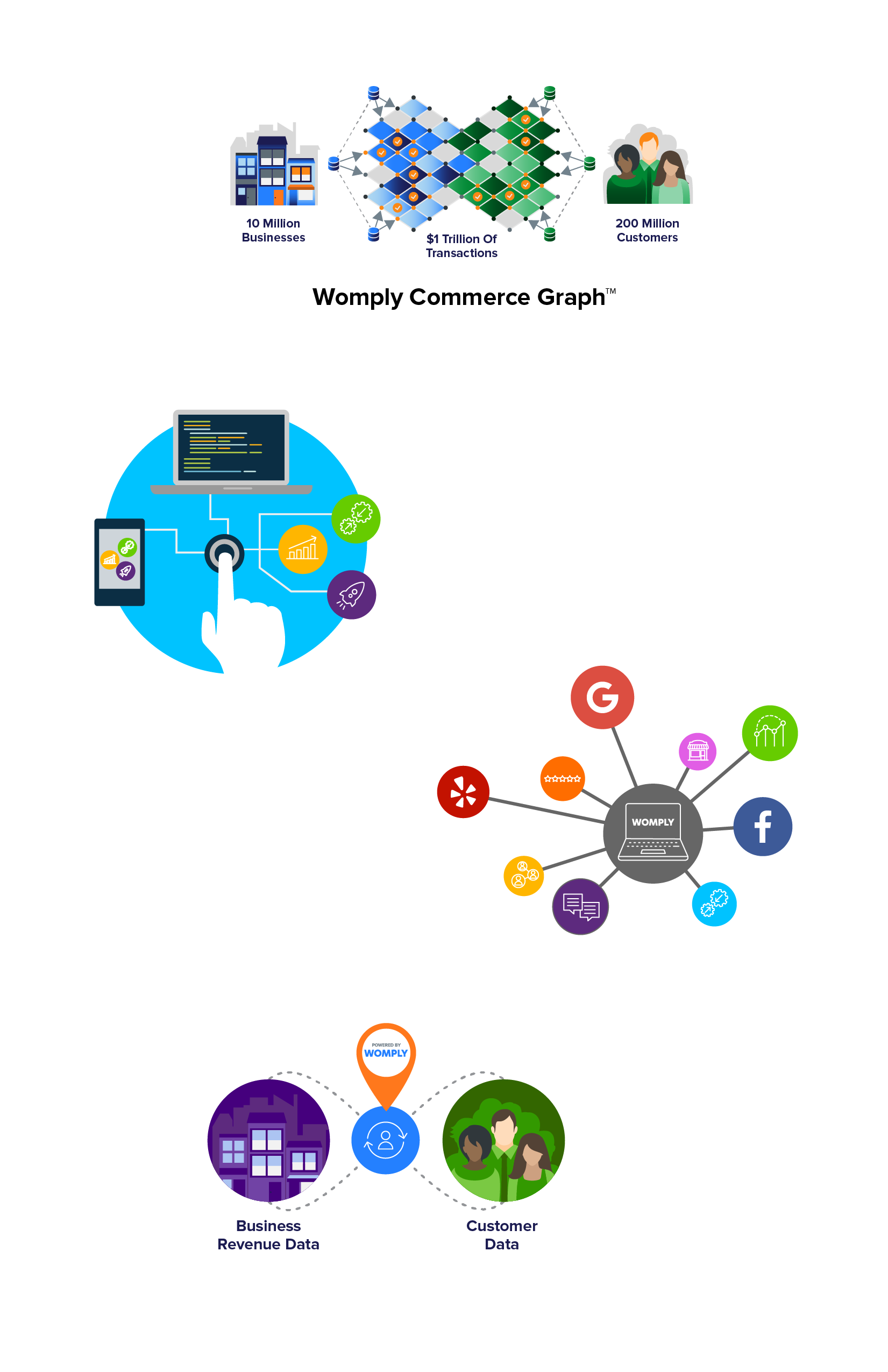
When I first started working with Womply, there was not a distinctive or consistent style of illustration or iconography. There were servers different color themes, styles, and forms of illustrations that made it difficult to market and tell the various Womply stories effectively.
Our internal teams did competitive research, talked with current customers, tested ideas to discover the best route for creating a new system. We discovered that we needed an illustrative style that was sophisticated enough to make customers feel we were the leaders in our areas but not so much that potential customers that were less savvy would be scared away.
Womply’s system needed to be friendly, approachable, and yet have an air of high-tech. So our colorful palette, simple yet modern characters, and the integration of a new ICON system as well - tested very well and became the basis of our new design style.
Clean and consistent style of icons that would scale as a group added to an overall better scheme of pieces to build our stories.
Below are examples of illustrations and icons, as well as their use together, invidious forms. As well as some examples of infographics that utilize the same components, creating consistent story telling across websites, social media posts, print, event, and app materials as well.