FlexPod is a partnership product line from Cisco and Netapp. The visual identity had done well, but was a bit outdated. The idea was not to do a complete re-brand, but to clean it up, simplify it and bring in some more modern elements to make it more flexible. Our internal team worked closely with Yeager Marketing to develop this update, that had a quick turnaround to meet market pressure and upcoming events.
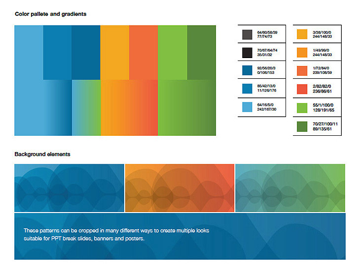
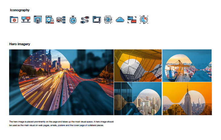
The FlexPod rebrand included: An updated logo that uses a a new version of the “bubble” element from the older FlexPod branding. A simplified and more modern color pallet with limited colors that work well together. Graphic use of the “bubble” elements as backgrounds and use in conjunction with photography and animations. New brand guidelines that work within Cisco and NetApp brand standards as well as new datasheet, poster, flyer, email and presentation templates. This also included rebranding of the physical products.

Updated, fully responsive, website
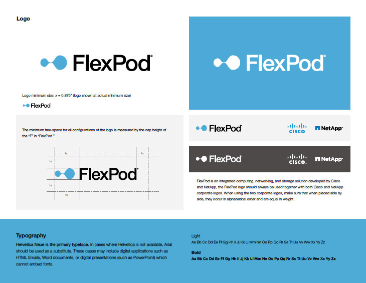
Updated logo with simplified bubble and mark
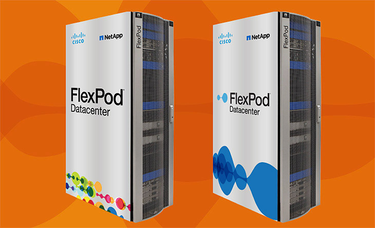
Updated Product Graphics
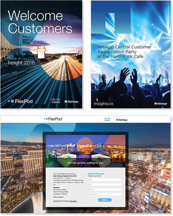
Promos for NetApp Event in Las Vegas